
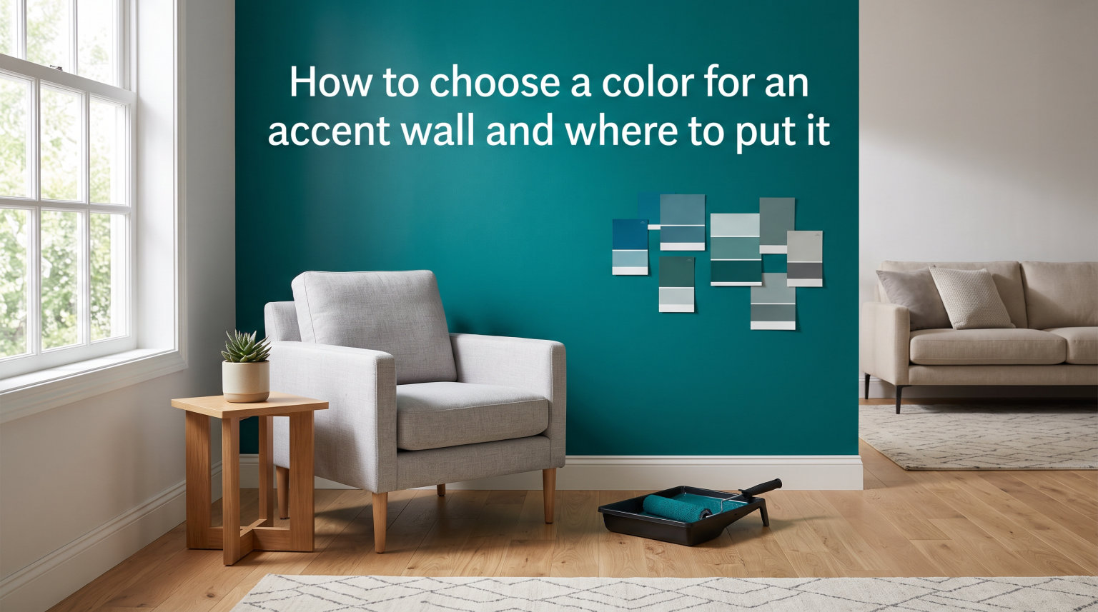
If you want to add personality to a room without painting every wall, learning how to choose a color for an accent wall and where to put it is the fastest way to transform a space. An accent wall gives you a controlled pop of color, a clear focal point, and a sense of depth that flat, single-color rooms often lack. In this guide, I will walk you through the exact steps I use when helping clients pick the right accent wall color and position.
Table of Contents
What Is an Accent Wall and Why Use One?
An accent wall (also called a feature wall or focal point wall) is a single wall in a room finished in a contrasting color, pattern, or texture. Its job is to draw the eye and anchor the room visually.
Designers use accent walls for three main reasons. First, they create depth in rooms that feel flat or boxy. Second, they let you experiment with bold colors without committing the entire space. Third, they highlight architectural features like fireplaces, headboards, or built-in shelving.
When done right, an accent wall makes a room feel intentional and finished. When done wrong, it can make the room feel smaller, lopsided, or stuck in the wrong decade. The rest of this guide helps you get it right the first time.
The 60-30-10 Color Rule Explained
Most interior designers follow the 60-30-10 rule when planning any room’s color scheme. It is the simplest framework for choosing how to choose a color for an accent wall that actually looks balanced.
Here is how the rule breaks down:
60% dominant color – This covers the largest surfaces: the main wall color, large furniture, area rugs, and big fabric pieces like curtains.
30% secondary color – This is your supporting shade, often found in accent furniture, bedding, or secondary walls.
10% accent color – This is where your accent wall typically lives, along with throw pillows, artwork, and small decor pieces.
The accent wall you choose should pull from that 10% category, or it can become the dominant color in a smaller room where you flip the ratios. The point is to keep your color distribution intentional rather than accidental.
If your existing room already has a dominant and secondary color, choose your accent wall shade from a complementary color family. This keeps the palette tight and the visual flow smooth.
How to Choose the Right Wall for an Accent
Picking the wall to accent is just as important as picking the color. Here is the order I follow when deciding which wall to treat as the feature wall.
Step 1: Identify the Room’s Natural Focal Point
Look around the room and find the wall that already draws your eye. Common natural focal points include the wall behind a bed’s headboard, the wall containing a fireplace, and the wall with the largest window.
If the room does not have an obvious focal point, the wall directly opposite the main entrance is usually a safe choice because it is the first thing you see when walking in.
Step 2: Avoid Walls with Visual Interruptions
Skip walls with multiple doors, large built-ins, or busy window arrangements. These interrupt the accent color and make it feel like a patch rather than a statement.
Step 3: Consider the Light Source
The wall that gets the most natural light will show off your color most accurately. North-facing rooms produce cooler light, while south-facing rooms warm up colors significantly.
Step 4: Match the Wall to the Furniture Layout
The accent wall should support the room’s primary furniture arrangement. In a bedroom, that is usually the wall behind the bed. In a living room, it is the wall the sofa faces or the one containing the TV.
Light vs Dark: When to Choose Each
A common question I hear is whether the accent wall should be lighter or darker than the rest of the room. The honest answer is that both work, but they create very different effects.
Go darker when: you want the wall to feel grounding, you want to make a large room feel cozier, or you have a piece of art or furniture that deserves a dramatic backdrop. Dark accent walls also work well behind the bed to create a hotel-like sense of intimacy.
Go lighter when: the room is small or has limited natural light, you want the accent wall to feel airy rather than dramatic, or your existing decor already includes dark furniture you do not want to compete with.
Benjamin Moore recommends choosing a color two to three shades lighter or darker than the surrounding walls for optimal contrast. Anything beyond that starts to look disconnected rather than coordinated.
Color Selection Principles That Actually Work
Once you know which wall to paint, choosing the actual color comes down to a few repeatable principles. Here is the process I use when picking accent wall colors for clients.
Start with the existing palette. Look at your furniture, flooring, and large textiles first. Your accent wall color should complement these, not fight them.
Identify the undertones. Most neutral paint colors have hidden warm (yellow, red) or cool (blue, green) undertones. Match the accent wall’s undertone to the undertones already present in the room.
Use the color wheel for inspiration. Complementary colors (opposite on the wheel) create energy. Analogous colors (next to each other) create calm. Pick the mood you want before choosing the hue.
Consider the 60-30-10 rule from the previous section. Make sure your accent color fits into the 10% role of the room’s overall palette.
Test the color in the actual room. Buy sample pots and paint large swatches on the wall. Look at them at different times of day before deciding.
This process removes guesswork and keeps the choice grounded in your specific room rather than a generic trend.
Room-by-Room Accent Wall Guidance
Different rooms call for different accent wall strategies. Here is how I approach the most common spaces.
Bedroom Accent Walls
The wall behind the bed is almost always the right choice. It frames the headboard, anchors the bed, and gives you a chance to introduce a deeper or richer color without overwhelming the room’s relaxing feel.
Muted blues, soft greens, warm taupes, and even deep charcoals work well in bedrooms. Avoid bright reds and electric yellows because they tend to overstimulate the space.
Living Room Accent Walls
In the living room, accent the wall that contains the fireplace, the wall the sofa faces, or the wall opposite the main entry. These positions give the accent wall maximum visual impact.
Earthy greens, navy blues, terracotta, and warm grays are popular living room accent wall colors in 2026. They pair well with both modern and traditional furniture.
Home Office Accent Walls
Pick the wall that sits behind your desk or in your camera’s frame if you take video calls. A calm, focused color like sage green, muted blue, or warm beige works well here.
Steer clear of high-saturation reds and oranges, which can make long work sessions feel more tiring.
Dining Room Accent Walls
The accent wall in a dining room should make the space feel inviting. Deep greens, moody blues, and warm burgundies create a sense of occasion that suits dinners and gatherings.
Entryway Accent Walls
Entryways are perfect for bold accent colors because guests only spend a few minutes in them. Use the wall directly opposite the front door to make a memorable first impression.
Testing Paint Samples Before You Commit
One of the most common mistakes I see is choosing a color from a tiny swatch card under store lighting. Paint always looks different in your actual room, so testing is non-negotiable.
Buy sample pots of two or three top contenders. Paint large 2-foot by 2-foot squares on the accent wall itself, not on a separate board. Let the samples dry completely, then observe them at three times: morning, afternoon, and evening under artificial light.
If you are torn between two shades, live with the samples for three full days. Colors shift under different lighting conditions, and a 72-hour test catches most surprises before they become expensive mistakes.
Common Accent Wall Mistakes to Avoid
These are the issues I see most often, plus how to fix them.
Picking the wrong wall. If your accent wall feels random rather than intentional, the wall choice is usually the problem. Move the focal point or rearrange the furniture instead of repainting.
Too much contrast. A color that is ten shades darker than the others creates visual tension rather than harmony. Stay within two to three shades for a polished look.
Ignoring undertones. A warm beige next to a cool gray will always look slightly off. Match undertones across all the room’s colors.
Skipping the test patches. Always sample first. Paint always looks different on the wall than on the chip.
Choosing a trendy color without considering longevity. Bold fuchsia might feel right now, but will it still feel right in five years? Pick colors you can live with long term.
Are Accent Walls Outdated in 2026?
Accent walls are not outdated. What is outdated is the predictable version: one dark wall in an otherwise forgettable room. In 2026, the trend has moved toward intentional accent walls that use color drenching, textured finishes, wallpaper, or architectural paneling to create real visual interest.
If you are considering an accent wall, the answer is yes, as long as it is planned with intention rather than applied as a quick fix. The rooms that feel timeless are the ones where the accent wall looks like it belongs, not like it was an afterthought.
Frequently Asked Questions
How do I pick a color for an accent wall?
Start by identifying your room’s existing palette and the 60-30-10 color distribution. Choose a wall that already draws the eye, then pick a color two to three shades lighter or darker than the surrounding walls. Test the color with large sample swatches in the actual room before committing.
Should an accent wall be lighter or darker than the rest of the room?
It depends on the effect you want. Darker accent walls feel grounding and dramatic, while lighter accent walls feel airy and spacious. For most rooms, choose a shade two to three steps away from the existing wall color rather than jumping to the opposite end of the spectrum.
What is the rule for accent colors?
The 60-30-10 rule is the standard guideline. Use your dominant color on 60% of the room, your secondary color on 30%, and your accent color on 10%. The accent wall should pull from that 10% category or, in small rooms, become the dominant color while other elements shift into supporting roles.
Are accent walls outdated in 2026?
Accent walls are still in style in 2026 when they are done with intention. Outdated accent walls tend to be one dark wall in an otherwise bland room. Modern approaches use color drenching, wallpaper, texture, and architectural paneling to create a focal point that feels built in rather than bolted on.
Final Thoughts on Choosing Your Accent Wall
Knowing how to choose a color for an accent wall and where to put it comes down to two decisions: which wall already draws your eye, and which color complements your existing palette within the 60-30-10 framework. Test your top two or three shades on the actual wall, observe them at different times of day, and pick the one that feels intentional rather than trendy.
Once you have the right wall and the right color, the rest of the room will fall into place around it. That is the real power of an accent wall done well.