
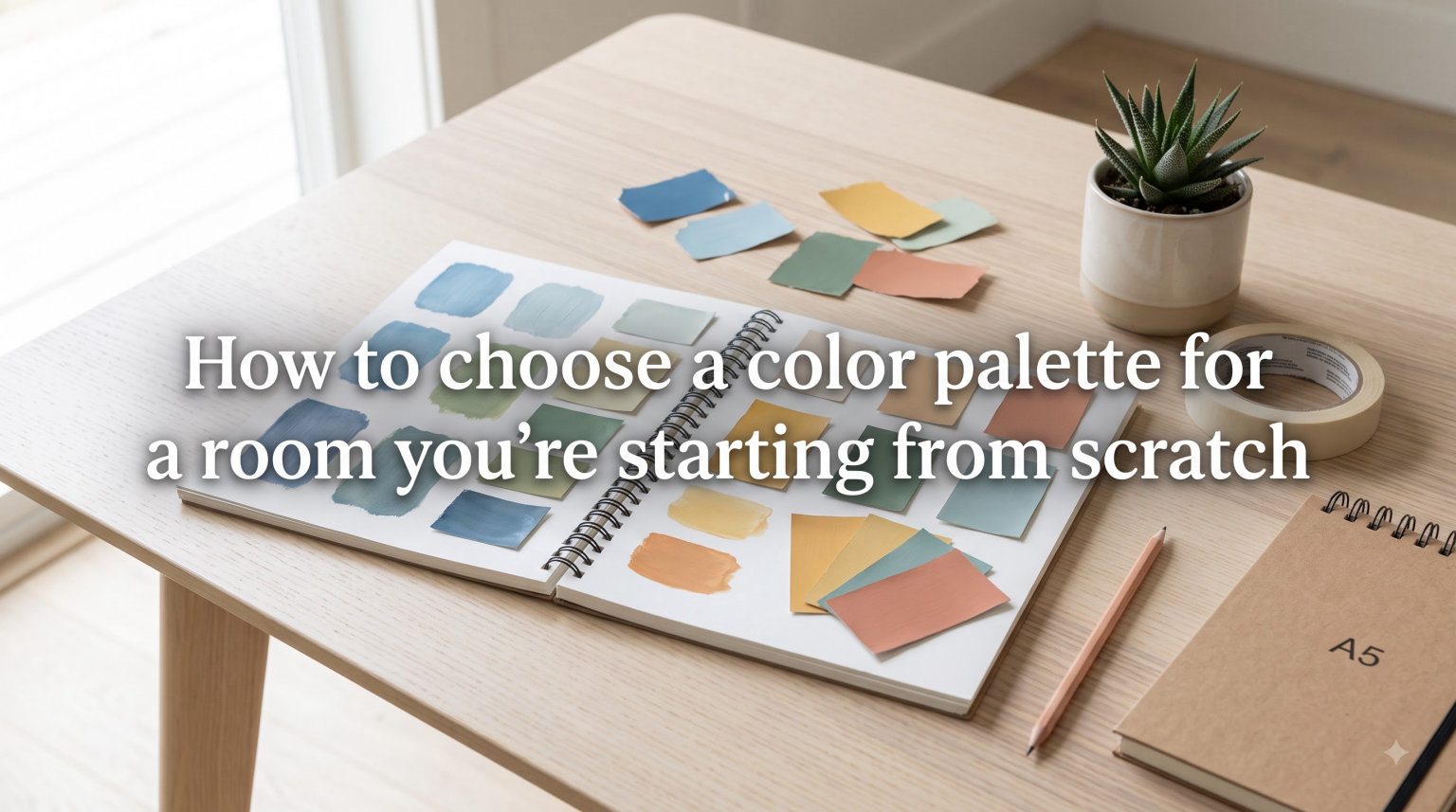
Learning how to choose a color palette for a room you’re starting from scratch can feel paralyzing. You’re standing in an empty space with blank walls, zero furniture, and hundreds of paint swatches swimming through your head. I’ve been there, and so have thousands of people on design forums who describe the exact same overwhelm.
Here’s the good news that most guides skip: starting from scratch is actually an advantage. You have no inherited sofa to clash with, no wrong-color rug to disguise, and no mismatched curtains to work around. You’re building on a blank canvas, and that freedom lets you create a space that feels intentional from day one.
In this guide, our team walks you through a proven process for picking colors when you have absolutely nothing to start with. We’ll cover the color fundamentals that actually matter, a step-by-step method you can follow tonight, the design rules that prevent expensive mistakes, and the tools that make the whole process faster and less intimidating.
By the end, you’ll have a clear plan and the confidence to choose colors you’ll love for years. Let’s turn that empty room into a space that feels like you.
Table of Contents
How to Choose a Color Palette for a Room: Color Fundamentals First
Before you pick a single paint chip, you need a working understanding of how colors interact. You don’t need an art degree, but a handful of core concepts will save you from costly do-overs and second-guessing.
The Color Wheel Is Your Starting Point
The color wheel organizes colors in a circle so you can see relationships at a glance. Primary colors (red, blue, yellow) sit evenly apart from each other. Secondary colors (green, orange, purple) fill the gaps. Everything else is a blend of those basics.
Three relationships matter most for interior spaces:
Analogous colors sit next to each other on the wheel, like blue and green. They create calm, cohesive rooms because they share underlying tones.
Complementary colors sit opposite each other, like blue and orange. They generate energy and contrast but can fight visually if used in equal amounts.
Monochromatic palettes use different shades and tints of a single color. This approach creates quiet sophistication and is nearly impossible to get wrong.
I recommend analogous or monochromatic schemes for beginners. They’re forgiving, look intentional even when you feel unsure, and they make coordinating furniture much simpler down the line.
Warm Colors vs Cool Colors Changes Everything
Every color reads as either warm or cool, and this single distinction shapes how a room feels the moment you walk in.
Warm colors like reds, oranges, yellows, and creamy whites make spaces feel cozy, intimate, and energizing. They can also make a compact room feel tighter than it is. Cool colors like blues, greens, and icy grays feel calm, spacious, and airy, but they can read as cold if you overuse them.
The best rooms balance both. A cool blue-gray wall paired with warm wood furniture creates depth that neither element could achieve alone. This warm-and-cool tension is what makes professionally designed rooms feel layered and complete.
Undertones Are the Hidden Dealbreaker
Here’s where most beginners get tripped up, and it’s the number one source of color frustration on forums like Reddit’s r/interiordecorating. Undertones are the subtle color hints hiding beneath the surface of any paint.
That neutral gray you love might carry a blue, green, or purple undertone. That warm white might lean yellow or pink. Undertones become painfully obvious the moment two colors sit next to each other. A blue-gray wall beside yellow-based trim looks muddy and wrong, even though both seemed neutral on their own.
To spot undertones, hold your paint chip next to a pure white sheet of paper in natural daylight. The hidden tint will jump out immediately. Once you train your eye to see undertones, coordinating colors across a room becomes dramatically easier.
Step-by-Step: How to Choose a Color Palette for a Room From Scratch
This is the exact process our team uses, and it works whether you’re decorating a bedroom, living room, kitchen, or an entire apartment from zero. Follow these six steps in order and resist the urge to skip ahead.
Step 1: Gather Inspiration Without Overthinking
Start by collecting images that catch your eye with zero analysis required. Create a Pinterest board, save photos from Instagram, and tear pages from magazines. Don’t filter yourself at this stage. If an image appeals to you, save it.
After you’ve gathered 20 to 30 images, step back and look for patterns. Are most rooms light and airy? Dark and moody? Full of earthy browns and greens? The repetition will reveal what you’re naturally drawn to, which is far more reliable than trying to decide intellectually.
Many people on Reddit’s r/DesignMyRoom community discovered their true color preferences this way. They describe it as a lightbulb moment where the pattern suddenly becomes obvious and the anxiety fades.
Step 2: Define How You Want the Room to Feel
Colors directly affect mood, so decide on your emotional goal before picking any specific hues. This step bridges the gap between what you like and what actually works in the space.
A bedroom should feel restful, so consider muted blues, sage greens, or warm soft neutrals. A dining room benefits from appetite-stimulating warm tones like terracotta or deep red. A home office might need focused, energizing colors like crisp white with green accents.
Write down three adjectives for how you want the room to feel. Calm, cozy, and grounded leads to very different color choices than bright, fresh, and energetic. This simple exercise prevents you from picking colors you love in isolation but that feel wrong once they’re on your walls.
Step 3: Pick Your Dominant Color First
Your dominant color covers the largest surface area, which usually means your walls. This is your foundation, and every other choice builds on it.
For beginners, I strongly recommend a neutral dominant color. Whites, creams, warm grays, and soft taupes give you maximum flexibility. They let your furniture, artwork, and textiles carry the personality without competing for attention.
If you want a bolder wall color, choose one that has been softened with gray. Designers call these dirty colors. A muted teal is far easier to live with long-term than a vibrant turquoise. Sage green works beautifully on walls where kelly green would overwhelm the space within a week.
Step 4: Add Your Secondary and Accent Colors
With your dominant color locked in, choose one secondary color and one accent color. The secondary color covers furniture, rugs, and larger textiles like curtains. The accent color appears in smaller doses: pillows, art, throws, and decorative objects.
This gives you three colors total, which is the sweet spot for anyone starting from scratch. Going beyond three colors makes a room feel busy and unfocused very quickly.
A proven combination strategy is to keep your dominant and secondary colors in the same warm or cool family, then use your accent for contrast. For example, warm cream walls with warm tan furniture and a cool navy accent creates a balanced, layered look that feels professionally styled.
Step 5: Test Paint Samples Before You Commit
Never buy a full gallon of paint based on a tiny swatch alone. Paint looks dramatically different on a wall than it does on a small chip, and your room’s unique lighting changes everything.
Buy sample sizes of your top two or three choices. Paint large sections on different walls, at least two feet square each. Then live with those samples for a minimum of three days. Check them in morning light, afternoon light, and under your evening lamps.
This step catches undertone clashes, colors that read darker than expected, and shades that simply don’t feel right in your particular space. Forum users consistently name this as the single most important step they wish they had not skipped. A $10 sample can save you a $300 repainting mistake.
Step 6: Factor in Room Size and Natural Light
Your room’s physical characteristics should guide your palette choices. Light colors make small rooms feel more open and airy. Dark colors can make a spacious room feel intimate and wrapped, but they will shrink a compact space.
Pay close attention to which direction your windows face. North-facing rooms receive cool, bluish light that can make warm paint colors look muddy or flat. South-facing rooms get warm, golden light that intensifies warm tones and can wash out cool ones.
East-facing rooms are bright in the morning but dim through the afternoon. West-facing rooms shift dramatically from cool mornings to golden, warm evenings. Always test your paint samples during the time of day you actually use the room most.
Design Rules That Take the Guesswork Out of Color
You don’t have to reinvent the wheel every time. Professional designers rely on proven formulas that produce balanced, polished rooms consistently. These rules give you a framework so you can focus on creativity instead of second-guessing proportions.
The 60-30-10 Rule Is Your Color Blueprint
The 60-30-10 rule is the most reliable color formula in all of interior design. It divides your room’s color into three specific proportions that create automatic visual balance.
Here is how the percentages break down:
60 percent is your dominant color, covering walls, ceiling, and your largest rug.
30 percent is your secondary color, appearing in furniture, curtains, and larger textiles.
10 percent is your accent color, showing up in pillows, artwork, and small decor pieces.
This ratio creates harmony because the dominant color grounds the room, the secondary color adds interest without competing, and the accent color provides energy in controlled doses. I use this rule on every single project, and it has never failed to produce a room that feels intentional and complete.
The 3-5-7 Rule Helps You Scale Color Count
The 3-5-7 rule guides how many distinct colors you should include in a single room. Three colors create a clean, minimal look that’s perfect for beginners. Five colors add richness and personality for a more curated feel. Seven colors work in eclectic or maximalist spaces but require real skill to keep from becoming visual chaos.
For a room you’re decorating from scratch, start with three colors and expand to five as you add textiles, artwork, and accessories over time. This gives you room to grow into the space without risking clutter before you’ve even moved in furniture.
The 80-20 Rule Keeps Bold Color in Check
The 80-20 rule suggests using a neutral palette for 80 percent of your room and reserving the remaining 20 percent for bold, saturated color. This ratio is ideal if you love color but feel nervous about committing to it across large surfaces.
Paint your walls neutral, invest in neutral foundational furniture, and then go bold with colorful pillows, a vibrant rug, or striking artwork. If you tire of the bold accent in a year or two, it’s inexpensive and simple to swap out without repainting a single wall.
Common Color Mistakes to Avoid
I see the same mistakes repeated across forums, client homes, and even my own early projects. Here are the big ones to watch for:
Choosing colors under store lighting. Fluorescent retail lighting fundamentally misrepresents how paint will look in your home. Always test in your actual room.
Ignoring the ceiling. A stark white ceiling in a warm, deeply colored room can look jarring and unfinished. Consider a tinted or color-matched ceiling instead.
Forgetting about flow between rooms. In open floor plans or homes with visible sightlines, adjacent room colors should relate to each other. Choose a consistent neutral base throughout your home.
Going too matchy-matchy. Slightly different shades of the same color look richer and more layered than an exact match. Subtle variation adds depth that perfect matching kills.
Skipping the sample test phase. This is the most expensive mistake of all. Repainting an entire room costs time and money that a $10 sample could have prevented.
Tools and Resources for Building Your Color Palette
You don’t have to do this entirely by feel. Several tools make color selection faster, more confident, and more fun, whether you prefer digital exploration or hands-on testing.
Digital Color Palette Generators
Free online tools help you build and visualize color schemes in minutes:
Coolors lets you generate palettes with a single tap and lock in colors you want to keep while exploring others.
Canva Color Wheel shows you complementary, analogous, and triadic combinations visually so you can see relationships instantly.
Adobe Color offers advanced controls for fine-tuning saturation and brightness across your palette.
Color Hunt provides curated palettes created by a community of users, which you can adapt directly to your room.
These tools are excellent for exploring combinations and narrowing your options. Always confirm your final choices with physical paint samples though, because screens render colors differently than paint looks on an actual wall.
Physical Tools You Should Actually Use
Nothing replaces seeing color in your real space under your real light. Stock up on these essentials before you make any final decisions:
Paint fan decks from brands like Benjamin Moore or Sherwin-Williams give you the full spectrum of available colors in hand.
Sample-size paints let you test directly on your walls before committing to gallons.
Poster board samples let you paint large patches and move them around the room to test against different walls, corners, and light angles.
A pure white reference card helps you spot hidden undertones when comparing multiple chips side by side.
Color Strategies for Renters
If you’re in a rental and painting isn’t an option, you still have powerful ways to introduce a full color palette. Many of these approaches actually offer more flexibility than paint because you can take them with you when you move.
Removable peel-and-stick wallpaper creates a bold accent wall without damaging the underlying surface.
Large area rugs bring substantial color to your floor, which covers an enormous visual surface area.
Curtains and textiles add color vertically and can completely transform an otherwise neutral box.
Gallery walls with colorful framed art let you pack in multiple accent colors without touching the walls.
Bookshelf styling with colorful books, ceramics, and objects creates targeted color zones that feel deliberate.
Renters on design forums consistently report that textiles and art alone can make a white-walled apartment feel completely personalized and lived-in. You don’t need paint to have a color palette.
Building Confidence With Bold Color
If you’re drawn to bold color but afraid to commit, you’re not alone. This fear comes up constantly in forum discussions, and it’s a gap that most color guides don’t address. Here’s how to build your color courage gradually.
Start with a single accent wall in your boldest color and keep everything else in the room neutral. Live with it for a full month before making any further decisions. If you love it after that trial period, consider expanding the color. If it feels like too much, you’ve only painted one wall, which is an easy fix.
Colorful accessories are another low-risk entry point. A bold mustard-yellow lamp, a deep emerald-green throw blanket, or a vibrant oversized piece of art injects serious personality without any permanent commitment. Swap them seasonally if you want variety.
Color confidence grows with every room you decorate. There are no permanent mistakes in interior design, only learning opportunities that inform your next space. Every choice teaches you something new about your own taste.
FAQs
What is the 60-30-10 rule for color palette?
The 60-30-10 rule divides a room’s color into three proportions: 60% dominant color (walls and ceiling), 30% secondary color (furniture and large textiles), and 10% accent color (pillows, art, and small decor). This ratio creates automatic visual balance and is the most widely used color formula in interior design.
How do I pick a color palette for a room?
To pick a color palette for a room, start by gathering inspiration on Pinterest, define how you want the space to feel, choose a dominant neutral color for walls, add one secondary color for furniture, and one accent color for accessories. Always test paint samples on your walls for at least three days before committing to full gallons.
What is the 3-5-7 rule in interior design?
The 3-5-7 rule guides how many colors to include in a room. Three colors create a clean minimal look, five colors add richness and personality, and seven colors work for eclectic or maximalist spaces. Beginners should start with three colors and expand to five as they add textiles and accessories over time.
What is the 3 color rule in interior design?
The 3 color rule means using exactly three colors in a room: one dominant color, one secondary color, and one accent color. This creates a cohesive, uncluttered look that is easy to coordinate. It is the simplest version of the 60-30-10 rule and works especially well for beginners decorating from scratch.
What is the 80 20 color rule?
The 80-20 color rule means keeping 80% of your room neutral and reserving 20% for bold, saturated color. This ratio is ideal if you love color but feel nervous about large commitments. Paint walls neutral, buy neutral furniture, then add bold accents through pillows, rugs, and art that are easy to swap later.
Wrapping Up: Your Color Palette Journey Starts Here
Knowing how to choose a color palette for a room you’re starting from scratch comes down to a simple process: gather inspiration, define your mood, pick a dominant neutral, add a secondary and accent color, test everything with real samples, and trust proven rules like 60-30-10 to keep your proportions balanced.
Starting from scratch isn’t a disadvantage. It’s your chance to build exactly the room you want without compromise. Take it one step at a time, test before you commit, and remember that no color choice is truly permanent. Your first room is just the beginning of developing your eye and your confidence.
Grab a Pinterest board, pick three colors, and get started tonight. That empty room is waiting to become your favorite space in the house.