
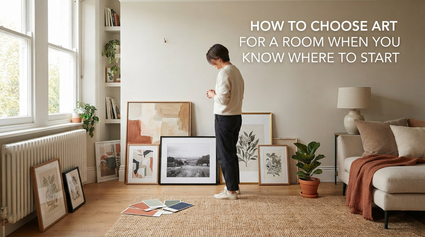
Standing in front of a blank wall with zero idea what to put on it is something almost everyone goes through. I’ve been there myself, staring at empty drywall for months, paralyzed by the fear of picking the wrong piece. If you are wondering how to choose art for a room when you do not know where to start, you are in the right place.
Our team has helped dozens of friends and family members fill their walls with pieces they genuinely love. Along the way, we noticed that the overwhelm people feel comes from treating art selection like a test with one right answer. There is no single correct choice, but there is a reliable process that gets you from blank wall to finished room without the anxiety.
This guide breaks that process into five clear steps. You will learn how to figure out your room’s style, nail the correct size on the first try, decide between a single statement piece and a gallery wall, work with your color palette (or intentionally break from it), and position art so it feels intentional rather than random. We also cover renter-friendly options, canvas versus framed art, and the most common mistakes beginners make so you can sidestep them entirely.
By the time you finish reading, you will have a concrete plan for every wall in your home. No more guessing, no more blank walls staring back at you.
Table of Contents
Step 1: Start with Your Room’s Style
Choosing art begins with understanding the room you are decorating, not with browsing art itself. Every room already has a style whether you planned it or not, and your art should either reinforce that style or provide a deliberate counterpoint to it.
Look around your space and identify the dominant aesthetic. Is your furniture clean-lined and minimal? That leans modern or Scandinavian. Do you have warm woods, woven textures, and earthy tones? That reads more bohemian or farmhouse. Leather, metal, and exposed brick suggest industrial. Knowing this gives you a foundation to work from.
Once you identify the style, you can choose art that fits naturally or adds tension. A minimalist room pairs beautifully with abstract pieces in muted tones. A farmhouse kitchen comes alive with botanical prints or landscape photography. An industrial loft can handle bold, graphic poster art. The key is intentionality, whether you are matching or contrasting.
How to Figure Out Your Style If You Are Not Sure
If you cannot name your room’s style, do not worry. Most people cannot on the first try. Here is a shortcut that works for us every time.
Take photos of your room from three different angles. Then open Pinterest or any image search and save 10 to 15 art pieces that catch your eye, without overthinking why. Lay them side by side with your room photos. Patterns will emerge. You might notice you gravitate toward black-and-white photography, or that you keep saving abstract florals, or that every piece you chose shares a warm color palette.
That pattern is your style. It might not have a label, and it does not need one. What matters is that you now have a visual language to shop with.
Should Art Match the Room or Stand Out?
This is one of the most common questions we hear, and the answer surprised us when we first started digging into it. One of the most upvoted pieces of advice on interior design forums comes from a seasoned designer who said: never match your art to your decor. Embrace friction.
What that means is art does not need to coordinate like a matching set of curtains and throw pillows. In fact, the most interesting rooms have art that introduces something new. A neutral, beige living room with a vibrant, oversized abstract painting creates energy. A maximalist room with a single quiet, contemplative photograph creates a moment of calm.
The rule of thumb we follow: pick one direction and commit. Either the art blends in for a serene, cohesive look, or it stands out for a dynamic, collected feel. The mistake is landing awkwardly in the middle, where the art almost matches but not quite.
Step 2: Get the Size Right (The 2/3 Rule Explained)
Size is the single most common thing people get wrong, and getting it wrong is the fastest way to make expensive art look cheap. Art that is too small for the wall or furniture beneath it looks like an afterthought. Art that is correctly sized instantly looks intentional and polished.
The golden rule for sizing art is called the two-thirds rule. Your artwork should fill approximately two-thirds to three-quarters of the width of the furniture or architectural feature below it. So if your sofa is 90 inches wide, your art (or grouped arrangement) should measure between 60 and 68 inches wide.
For a bare wall with no furniture underneath, the art should cover roughly two-thirds to three-quarters of the available wall width, accounting for any architectural elements like windows or doorframes. This creates visual balance and prevents the piece from floating aimlessly.
Specific Size Guidelines for Every Placement
Different rooms call for different sizing approaches. Here are the measurements we use as starting points based on standard furniture dimensions.
Above a sofa: Aim for art that is 57 to 60 percent of the sofa’s total width, minimum. A standard 84-inch sofa needs art spanning at least 48 inches wide. Going larger, up to 75 percent of the sofa width, creates a more dramatic look.
Above a bed: The art should span 60 to 75 percent of the bed’s width, including the headboard. For a queen bed (60 inches wide), that means art measuring 36 to 45 inches across. For a king bed (76 inches wide), look for 46 to 57 inches.
Above a console or sideboard: Target 50 to 75 percent of the furniture’s width. A 48-inch console table pairs well with art measuring 24 to 36 inches wide.
In a dining room: Larger is almost always better here. Since there is no single piece of furniture anchoring the art, go big enough to fill at least half the wall space between the ceiling and the top of the table.
How High Should You Hang Art?
The standard hanging height is 57 to 60 inches from the floor to the center of the artwork. This is gallery height, and it works because it places the art at average eye level for most people.
When hanging art above furniture, leave 6 to 8 inches of space between the bottom of the frame and the top of the furniture. Any more than 10 inches and the art starts to look disconnected, floating above the piece it should be anchoring. Any less and the arrangement feels cramped.
If you have high ceilings, resist the urge to push art higher to fill the vertical space. Keep the same 57 to 60 inch center height and let the space above the art breathe. You can always add a second row of smaller pieces or a tall plant to draw the eye upward.
Step 3: Choose Between a Single Piece or a Gallery Wall
Once you know your style and size range, the next decision is format. A single large piece makes a bold, confident statement. A gallery wall creates depth, personality, and visual movement. Both are valid, and the right choice depends on your space and how much energy you want the wall to have.
When a Single Large Piece Works Best
Go with one large piece when you want the wall to feel calm and deliberate. A single oversized canvas or framed print draws the eye immediately and establishes a clear focal point. This approach works particularly well above sofas, beds, and fireplaces where one strong visual element grounds the entire arrangement.
Single pieces also work well for beginners who feel overwhelmed by the idea of curating multiple frames. You make one decision and you are done. Just make sure the piece is large enough to hold the wall on its own. A 24-inch print floating above a 90-inch sofa will always look too small, no matter how beautiful the art itself is.
When a Gallery Wall Works Better
Gallery walls shine when you want to tell a story or display a collection. They work beautifully on large, empty walls, in stairwells, hallways, and behind dining tables. A well-designed gallery wall feels collected over time, which adds warmth and personality that a single mass-produced piece cannot match.
Gallery walls are also more forgiving for beginners working with a budget. You can combine affordable prints, personal photographs, found objects, and even mirrors into one cohesive arrangement. The variety keeps the eye moving and makes each individual piece feel less pressured.
How to Build a Gallery Wall Without Losing Your Mind
The biggest mistake people make with gallery walls is hanging pieces one at a time and hoping for the best. That leads to crooked arrangements and unnecessary nail holes.
Instead, trace each frame onto kraft paper or newspaper and cut out the shapes. Tape the paper templates to your wall using painter’s tape. This lets you experiment with spacing, arrangement, and balance before you commit to a single nail. Once the layout looks right, mark where each hook goes, remove the paper, and hang everything.
Keep consistent spacing between frames. Two to three inches between each piece is the sweet spot. Less than that and the arrangement feels cluttered. More than four inches and the frames stop reading as a group.
Grid vs Salon Style: Which Layout to Choose
A grid arrangement uses identical frames in a uniform pattern, like two rows of three or three rows of three. It looks clean, modern, and deliberate. Grids work best when your pieces share a theme, like a series of black-and-white photographs or a set of botanical prints.
A salon-style arrangement mixes frame sizes, orientations, and sometimes styles. It looks organic and collected. Salon walls work best when you want an eclectic, personal feel. Start with your largest piece slightly off-center and build outward, balancing large and small pieces on each side.
Another option worth considering is a diptych or triptych, where a single image is split across two or three panels. This gives you the impact of a large piece with the practical advantage of smaller, easier-to-hang sections. Diptychs and triptychs look especially striking above wide sofas and beds.
Step 4: Match or Contrast Your Color Palette
Color coordination is where beginners tend to freeze up, worried that art will clash with their decor. Understanding a couple of simple principles removes that fear entirely and lets you make confident color decisions.
The 70-30 Rule for Color in a Room
The 70-30 rule is a foundational interior design principle that keeps rooms from feeling chaotic. It means one dominant color should account for roughly 70 percent of the visual space in a room, while a secondary color fills the remaining 30 percent. This applies to walls, furniture, textiles, and art combined.
For example, if your room is 70 percent neutral (white walls, beige sofa, cream rug) and 30 percent accent (navy pillows, a blue throw, wood tones), your art can sit in either category. A neutral-toned landscape print reinforces the dominant palette for a calm, cohesive feel. A bold navy or jewel-toned abstract piece extends the accent color and adds energy.
The rule prevents two things: a room that feels flat because everything is the same tone, and a room that feels cluttered because too many colors are competing. Art is a powerful tool for adjusting that balance.
Matching vs Contrasting: How to Decide
Pulling a color from your room into your art is the safest approach for beginners. If you have terracotta throw pillows, a piece with warm orange and rust tones will feel intentional and connected. If your room features sage green accents, artwork with botanical greens creates harmony.
But do not be afraid of contrast. A piece that introduces an entirely new color can energize a room. One forum user shared that after years of bare walls, they finally hung a bright, multi-colored abstract painting in their neutral bedroom. The contrast became the thing guests always commented on first.
When contrasting, pick one or two colors from the art to echo elsewhere in the room. If you choose a painting with pops of mustard yellow, add a small mustard accessory nearby. This creates a thread that ties the art to the space without requiring everything to match.
Black, White, and Neutral Art as a Safe Starting Point
If color decisions feel paralyzing, start with black-and-white photography or neutral-toned art. These pieces work in virtually any room regardless of the color scheme. They add texture and interest without introducing competing colors.
Black-and-white photography is especially versatile. A large architectural print, a moody landscape, or an abstract black-and-white study can anchor a wall in any room from modern to traditional. It is the closest thing to a guaranteed win for someone who is unsure where to begin.
Step 5: Make the Art Your Focal Point (or Not)
A focal point is the first thing your eye lands on when you enter a room. Art is one of the most effective ways to create or reinforce a focal point, but it is not the only option, and sometimes your art should play a supporting role instead.
When Art Should Be the Star
In rooms that lack a natural focal point like a fireplace, a large window with a view, or a dramatic piece of furniture, art fills that role perfectly. A bold, oversized piece on the wall you face when you walk in immediately gives the room a center of gravity.
Living rooms and dining rooms are natural candidates for art-as-focal-point. The wall above the sofa or the wall facing the dining table are prime spots. Choose something with enough scale and presence to hold the space, and keep surrounding decor minimal so the art does not compete for attention.
When Art Should Support Another Element
In a bedroom, the bed itself is usually the focal point. Art above the headboard enhances the bed rather than stealing focus. In this case, the art should complement the bedding and nightstand styling rather than overpower them.
In a room with a stunning architectural feature like a large window, a fireplace, or built-in shelving, art can play a supporting role. Smaller pieces flanking a fireplace or a single print leaning on a bookshelf shelf add personality without competing with the room’s natural focal point.
Layering Art with Other Decor Elements
Art does not exist in isolation. It interacts with everything around it, and paying attention to those interactions separates a designed room from a decorated one.
Consider the relationship between art and lighting. A picture light or well-placed sconce above a piece adds drama and draws the eye. Sconces flanking a piece of art frame it and create symmetry.
Think about what sits below or beside the art. A console table beneath a piece should have objects that complement the art’s colors or theme without competing. A tall plant next to a framed print adds organic texture and height variation.
One thing we always check: does the art relate to at least one other element nearby? A connection to a lamp color, a vase shape, or a rug pattern makes the arrangement feel deliberate. Art that relates to nothing around it can look like it was placed randomly.
Canvas vs Framed Art: Which Should You Choose?
The choice between canvas and framed art affects both the look and the practicality of your wall decor. Each format has distinct advantages depending on your space, style, and budget.
Canvas prints offer a modern, frameless look that works well in contemporary and casual spaces. They are typically lighter than framed pieces, which makes them easier to hang and better suited for renter-friendly solutions. Canvas also tends to be less expensive at larger sizes, since you are not paying for matting, glass, and framing materials.
The downside of canvas is that it can look unfinished in traditional or formal settings. Without a frame, canvas edges are visible from the side. Lower-quality canvas prints can also sag over time, and they are harder to clean than glass-covered framed pieces.
Framed art offers a more polished, finished appearance that works across virtually any style. A well-chosen frame can tie a piece to your room’s wood tones, metal finishes, or color palette. Frames also protect the artwork from dust and damage, and glass or acrylic glazing makes cleaning simple.
The trade-off with framing is cost and weight. Custom framing can be expensive, sometimes costing more than the art itself. Framed pieces are heavier and require more secure hanging hardware, which matters if you are renting or have drywall you want to protect.
Our recommendation for beginners: start with ready-to-hang framed prints from retailers that include the frame. This gives you the polished look of framing without the custom price tag. As you develop your collection and taste, you can invest in custom framing for pieces that deserve it.
Renter-Friendly Art Solutions That Won’t Cost Your Deposit
One of the biggest barriers to decorating with art is the fear of wall damage, especially for renters. We have seen countless people live with bare walls simply because they cannot or do not want to put holes in drywall. The good news is there are excellent damage-free options in 2026.
Command Strips and Hooks
Command strips remain the most popular damage-free hanging solution for good reason. They hold surprisingly well when used correctly and remove cleanly without leaving residue or marks. For framed art, use Command picture hanging strips rated for the weight of your piece.
The key to success with Command strips is following the instructions precisely. Clean the wall surface with rubbing alcohol first, press firmly for 30 seconds, wait at least one hour before hanging, and never exceed the weight rating. For heavier pieces, use multiple strips distributed across the top and bottom of the frame.
Leaning Art Instead of Hanging
One of the easiest renter-friendly approaches is to skip hanging entirely and lean your art instead. Large pieces leaned against the wall on the floor behind a sofa or armchair create a relaxed, gallery-like feel. Smaller pieces layered on a console table, mantel, or bookshelf add personality without a single nail hole.
Leaning art has a design advantage too. It is effortless to rearrange, swap, and update. You can change your entire wall display in five minutes without any tools. This flexibility is especially valuable if you like to refresh your space seasonally or if you are still figuring out your style.
Other Damage-Free Options
Picture rails, if your rental has them, are a classic solution. These wooden moldings near the ceiling let you hang art from rods and wires without touching the wall below. If your space does not have picture rails, freestanding picture ledges mount with just a few small screws or heavy-duty strips and let you display multiple pieces in a row.
For lightweight pieces like posters and prints, washi tape provides a decorative, fully removable mounting option. It comes in hundreds of colors and patterns, so the tape itself becomes part of the design. This works especially well in bedrooms, dorm rooms, and casual spaces where a playful look fits the mood.
Common Mistakes to Avoid When Choosing Art
After years of helping people fill their walls, we see the same handful of mistakes over and over. Avoiding these will save you money, time, and frustration.
Mistake 1: Going Too Small
This is by far the most common error. People buy art that looks large enough in the store or online, only to get it home and realize it disappears on the wall. Remember the two-thirds rule and always measure your wall and furniture before buying. When in doubt, go bigger.
A useful trick: before purchasing, cut a template from cardboard or paper in the exact dimensions of the piece you are considering. Tape it to your wall and live with it for a day. This eliminates guesswork and prevents expensive returns.
Mistake 2: Hanging Art Too High
Art hung too high feels disconnected from the room, like it is trying to escape through the ceiling. The standard gallery height of 57 to 60 inches to the center applies in almost all situations. In dining rooms where people are seated, you can go slightly lower so the art is at eye level when sitting.
Mistake 3: Matching Everything Too Perfectly
Rooms where every single element shares the exact same color palette can feel sterile and impersonal, like a furniture showroom rather than a lived-in home. The best rooms have a touch of tension and surprise. Let your art introduce something unexpected.
As that popular design forum advice goes, embrace friction. A piece that does not perfectly match your room can be the thing that makes the space memorable and personal.
Mistake 4: Ignoring Your Own Taste for Trends
Trends come and go, but you have to live with your art every day. One forum user shared a story about gallery walls: they had carefully arranged one in their living room for years, only to realize they never actually saw the individual pieces anymore. The arrangement became invisible.
Buy art that makes you feel something when you look at it. If you love a piece, it will work in your space. If you are buying it because it looks like what you saw on social media, you will likely tire of it within a year. Trust your gut. The most consistent advice from professional designers is the simplest: if you love it, it will find a home.
FAQs
What is the 70-30 rule in art?
The 70-30 rule states that one dominant color should make up about 70 percent of a room’s visual space, while a secondary color fills the remaining 30 percent. This applies to walls, furniture, textiles, and art combined. Art can sit in either category. A neutral-toned piece reinforces the dominant palette for a calm look, while a bold accent-colored piece extends the secondary palette and adds energy. The rule prevents rooms from feeling either flat or chaotic.
How to pick artwork for a room?
Start by identifying your room’s style, then choose art that either matches or intentionally contrasts with it. Measure your wall and furniture to determine the correct size using the two-thirds rule, where art should span 60 to 75 percent of the furniture width below it. Decide between a single statement piece or a gallery wall based on the energy you want. Consider your color palette using the 70-30 rule, and make sure the art relates to at least one other element in the room.
What is the 2/3 rule for wall art?
The 2/3 rule says your artwork should fill approximately two-thirds to three-quarters of the width of the furniture or wall feature below it. For a 90-inch sofa, that means art measuring 60 to 68 inches wide. For a queen bed (60 inches wide), aim for art spanning 36 to 45 inches. The rule ensures art looks proportional and intentional rather than too small and floating aimlessly on the wall.
What are the 5 C’s of art?
The 5 C’s of choosing art are composition, color, contrast, content, and connection. Composition refers to how the elements within the artwork are arranged. Color relates to how the piece’s palette interacts with your room. Contrast is the visual tension between the art and its surroundings. Content means the subject matter and whether it resonates with you personally. Connection is the emotional response you feel when you look at the piece. Evaluating art through these five lenses helps you choose pieces that work both visually and personally.
You Already Know More Than You Think
Learning how to choose art for a room comes down to five straightforward steps: know your room’s style, nail the size with the two-thirds rule, pick your format, work with color using the 70-30 principle, and position art where it creates the right focal point. That is the entire process. No design degree required.
The biggest takeaway we want to leave you with is this: the art you choose does not need to be perfect, and it does not need to match anyone else’s idea of what belongs in your home. Start with one wall, one piece you genuinely love, and build from there. You can always rearrange, swap, and add more over time.
Blank walls are just walls that are waiting for you to decide. Now you have the tools to decide well.