
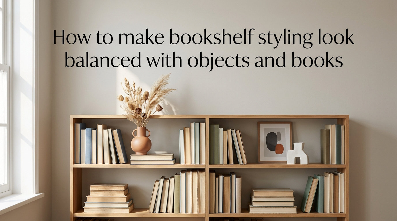
I have restyled my own shelves three times this year, and the difference between a flat row of books look and a layered, magazine-worthy display always comes down to balance.
If you have ever stared at a bookshelf and thought this just looks off, you are not alone. Most guides assume you own ten matching vases and zero paperbacks. In this guide, I will walk you through the exact process I use to make bookshelf styling look balanced with real objects and real books, including book-heavy shelves, small spaces, and tight budgets.
You will learn the fundamentals of visual weight, a repeatable 6-step process, room-specific tips, and the mistakes I see in 90% of styled shelves. By the end, you will know when a shelf is actually finished instead of just decorated. I have used this exact process in my own apartment, in my sister’s home office, and in a 400-square-foot studio rental, and it works every single time.
Table of Contents
Balance fundamentals: how visual weight shapes your bookshelf
Balance on a bookshelf is the even distribution of visual weight across every shelf so the eye moves smoothly from one section to the next. Visual weight is the perceived heaviness of an item based on size, color, texture, and density.
A dark hardcover novel feels heavier than a white linen-bound art book, even when they are the same height. A rough stone vase weighs more visually than a clear glass bud vase, even if both hold the same flowers. This is why a single dark object can balance three lighter objects across the shelf.
To create balanced bookshelf styling, distribute that weight using the rule of thirds. Imagine each shelf divided into three equal zones. Place a weight anchor in at least two of those zones, then let the third zone breathe with lighter items or empty space.
Your eye should travel in a gentle Z-pattern across the shelf. If everything crowds the left side, the right side feels empty and unfinished. If everything is centered, the shelf feels static and formal. Aim for gentle variation instead of perfect symmetry.
How to make bookshelf styling look balanced with objects and books in 6 steps
I teach this 6-step process to every friend who asks for help with their shelves. Each step builds on the previous one, so skipping ahead usually means restyling twice. Set aside about 90 minutes for the first shelf, then 30 minutes for each additional shelf.
Step 1: Start with a clean slate
Empty the entire shelf before you style anything. I know it feels wasteful, but you cannot see the bones of a shelf while it is half-covered.
Wipe down the inside and the back panel. Check for warped shelves or scuffs. Decide if the back needs a fresh coat of paint or a piece of wallpaper to add depth.
Group everything you removed into three piles: keep on this shelf, move to another shelf, and store or donate. Most people keep too much in the keep pile. Be honest about which objects you actually love, and which ones you only kept out of guilt.
Step 2: Pick a color palette before you place anything
A bookshelf without a color plan usually ends up looking like a garage sale. Choose 3 to 5 colors that repeat across your objects, books, and the room.
I pull these colors from the room first. If your sofa is sage green and your walls are warm white, lean on soft greens, creams, and one accent like rust or terracotta.
Stick to neutrals as your base, then add one or two accent colors. Mix matte and glossy finishes within the palette so the eye reads texture, not just color. Repeating the same color in three different places across a shelf creates instant cohesion.
Step 3: Vary horizontal and vertical book stacking
All vertical books create a fence. All horizontal stacks create a ledge. Balance bookshelf displays by mixing both.
A simple ratio I follow: two-thirds of your books stand upright, and one-third lies flat. Stack 2 to 4 books horizontally to create a base for a small object like a candle, a small sculpture, or a framed photo.
Vertical groups should also vary in height. Use risers, stacked books, or short bookends to lift some objects higher than others. A row of identical-height books feels clinical, while a varied height feels lived-in.
Step 4: Layer objects with varying heights and textures
Layering means placing items in front of and behind each other to create depth. A flat row of objects reads as a museum line-up, not a curated shelf.
Place your tallest object at the back of the shelf, medium-height items in the middle, and the smallest in front. Group items in odd numbers, usually 3 or 5, which feels more natural than pairs.
Mix textures to add interest. Pair a rough ceramic vase with a smooth brass bowl. Pair woven baskets with glass cloches. Pair books with a sprig of eucalyptus or a single stone. Texture is what makes a shelf feel collected instead of mass-produced.
Step 5: Create negative space on every shelf
Negative space is the empty area you leave on purpose. It is what makes a styled shelf feel calm instead of crowded.
Aim to leave roughly 20 to 30 percent of each shelf empty. That space is not wasted. It gives the eye a place to rest and lets each object feel intentional.
If a shelf feels too sparse, add one meaningful object instead of five small ones. If it feels too full, remove the weakest item and step back. Repeat until the shelf feels light. The hardest part of styling is removing things, not adding them.
Step 6: Balance symmetry and asymmetry
Symmetry feels formal and predictable. Asymmetry feels relaxed and collected. Most homes need a mix of both.
Use symmetry at the room level. Match the weight of the left end of the shelf with the right end, but vary the objects themselves. A stack of books on one side can balance a tall vase plus a small object on the other.
For asymmetrical balance, place a heavy dark object opposite a group of 2 to 3 lighter objects. The grouped items together carry the same visual weight as the single heavy piece. This trick is what designers use to make shelves feel interesting without losing balance.
How to balance a bookshelf when you have lots of books
Most bookshelf styling advice assumes you own 15 books and 40 vases. Real book lovers own 400 books and 5 vases. Here is how to handle that, because you should not have to choose between your books and a styled shelf.
First, sort books by color to create visual blocks. A shelf of all-white spines reads as calm and cohesive, even when tightly packed. A rainbow shelf reads as energetic and personal. Both work, as long as the colors are intentional.
Second, store overflow in baskets, under benches, or in closets. You do not have to display every book you own. Curating your visible collection is part of the styling process, and it usually makes the books you do display feel more meaningful.
Third, use books as objects. Stand a favorite hardcover upright with a small framed photo leaning in front. Lay a small paperback flat to prop up a candle. Let books do double duty as visual props, risers, and color blocks all at once.
Fourth, edit by genre or sentiment. Keep your favorites and reference books on display. Move textbooks, manuals, and unread paperbacks out of sight. A shelf full of books you love feels different from a shelf packed with books you feel obligated to keep.
Room-specific bookshelf styling tips for living rooms, offices, and kitchens
The same shelf rules apply everywhere, but the styling priorities shift based on how you use the room. A living room shelf is meant to be seen, an office shelf is meant to support focus, and a kitchen shelf is meant to be functional.
Living room built-ins
Living room shelves need to balance style and storage. Leave room for the things you actually use, like remotes, candles, and a current read.
Anchor each section with one large object, like a vase, a framed art print, or a tall plant. Spread your favorite books vertically across the shelf so the spines double as color blocks.
Home office shelves
Home office shelves should feel focused. Group reference books together, hide cables and supplies in matching boxes, and keep personal photos limited to 2 or 3 frames per shelf.
A single small plant or a piece of natural wood softens the office feel without distracting you. Avoid cluttering the shelf with too many visual statements, which can pull attention away from your work.
Kitchen open shelving
Kitchen shelves live or die by function. Leave breathing room above plates and glasses so you can actually lift them down without breaking anything.
Group everyday dishes by color or material. Add one decorative item per shelf, like a ceramic pitcher or a small piece of art, to keep the display from looking like a cabinet.
Small apartments and tight corners
In small spaces, less is more. A short shelf with 3 carefully chosen objects looks better than a tall shelf packed edge to edge.
Use the back of the shelf for taller items and the front for shorter ones, which frees up wall space behind. Consider a ladder shelf, where each level steps back to save square inches. Floating shelves above a desk or sofa also work well in tight rooms.
Budget-friendly bookshelf styling tips that actually work
You do not need a designer budget to style a shelf that looks pulled together. Most of my favorite styling objects came from thrift stores, my own kitchen, or nature.
Glass jars, vintage cups, and stoneware vases all make excellent bookends or small object displays. A single olive branch in a simple jar does the job of an expensive flower arrangement.
Books themselves are free styling tools. Group paperbacks by color, stack them to create height, or pull the covers off ugly hardcovers to reveal the linen beneath. A row of uniform paperbacks can look as polished as a set of expensive coffee table books.
For textural variety, gather small pieces of wood, sea glass, or pinecones from outside. These natural objects add warmth without adding clutter, and they cost nothing.
If you want to spend on one item, make it a single piece of art you genuinely love. Lean it against the back of the shelf instead of hanging it. One large piece usually beats three small ones and creates a stronger focal point for the whole shelf.
Common bookshelf styling mistakes to avoid
Even experienced stylists make these errors. The good news is they are easy to fix once you see them, and most take less than 10 minutes to correct.
Stuffing every shelf edge to edge
Cramming a shelf full of objects does not make it look rich. It makes it look cluttered. Pull items off until the shelf feels calm and each remaining piece has room to breathe.
Matching everything by color or set
A row of identical vases reads as a store display, not a personal collection. Mix 2 to 3 finishes in the same color family for depth. Real collections show variety.
Ignoring the back of the shelf
The back panel is a free styling surface. A soft paint color, a piece of removable wallpaper, or even a fabric panel adds dimension behind your objects and makes the whole shelf feel more layered.
Wrong scale for the shelf
Mini objects on a tall shelf disappear. Massive vases on a small shelf dominate. Aim for objects that fill about two-thirds of the shelf height so the eye reads them clearly.
Forgetting to style top to bottom
People often style the eye-level shelves and ignore the bottom. Pull items down or rotate your collection so every shelf feels intentional, including the top shelf you have to reach for.
Skipping the step-back test
After styling, walk to the other side of the room and look at the shelf from a distance. What looks balanced up close can feel lopsided from the couch. Take a photo on your phone to see what your guests actually see.
Frequently asked questions about balanced bookshelf styling
How to make a bookshelf look good with books?
Mix vertical and horizontal stacking, leave 20 to 30 percent empty space on each shelf, and add 2 to 3 small objects like a vase, frame, or candle between book groupings to break up the spines.
How to visually balance a bookshelf?
Distribute visual weight using the rule of thirds, placing a heavier anchor object in at least two of three zones per shelf. Mix tall and short items, dark and light colors, and rough and smooth textures so the eye moves smoothly across the display.
How to make a bookcase look less cluttered?
Remove items until each shelf has at least 20 percent empty space, store overflow books out of sight, and group small objects in odd numbers of 3 or 5. Edit ruthlessly and only keep items you love or use often.
What is the bookshelf rule?
The most common bookshelf styling rule is to vary horizontal and vertical book stacking, mix objects with books in a roughly 1 to 3 ratio, and leave negative space on every shelf so the display feels curated instead of crowded.
Final thoughts on creating a balanced bookshelf
Balanced bookshelf styling is not about owning the right objects. It is about placing the ones you already have using visual weight, color, texture, and negative space.
Start with one shelf this weekend. Empty it, pick a small palette, stack books in a new way, and leave breathing room. You will see the difference within an hour, and you will never look at a shelf the same way again in 2026.